Self Portrait
Created in 27thFeb, 2007
This is another assignment I made during high school.
The assignment was to use a photo as a base and recreate it in illustator.
I completed this within 2 hours using the tiny touch pad on my laptop at home.
My Canadian instructor didn't believe that I can complete such a beautiful piece within such a short period of time with such limited resources.
He asked me to redo it in class. He said that I must have cheated using one of those high tech conversion technic and complete it with just a few clicks in photoshop. I was very mad at him and I showed him how I did it. He said since I have so much time left and I have nothing to do in class I should do a second piece. I made him another rough one which I didn't put my heart in. This teacher even said that I can't get into university if I didn't submit my final assignment. In the end I quit that school because I felt that prejudice and boycotting doesn't help my education and career.
I can learn more by doing things on my own than from a useless instructor who doesn't know how to teach and respect their student's talent.

This was the initial design based on a photo I took on a beach playing sand.
I use various kinds of brush tools for the outline and hair.
The different parts of shading are transparent and they look really natural.


Above are 2 versions comparing how I could place the main character within the halo circle.
The one on the left would be focusing on her hands, the one on the right would be focusing on the whole character.
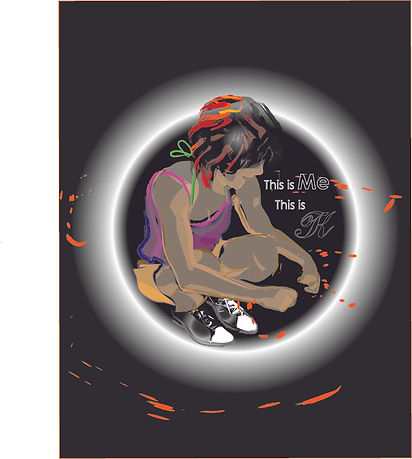
When I add a dark background with a halo of light circling behind the main character, the whole atmosphere changed dramatically.
Since the shading layers were created transparent, the thinner layers became darker and the light seems to emerge from her hands. This reversed effect was very interesting and it felt like she is emitting something in the dark.

This is the final vertical version that I favoured. It looks like a logo which I can use to represent myself. A self emitting person who tries to lighten up the dark.

Then I tried out how it could be placed horizontally.
It still looks pretty good so I kept this version as well.

I tried out different sizes and intensity of the halo and see how it might affect the overall effect.

This is the final outcome for the horizontal version.

In this version the character is enlarged and it looks like a logo.
This is the final version that I favoured. It looks like a logo which I can use to represent myself. A self emitting person who tries to lighten up the dark.


My work was incomplete without my initials to show it was drawn by me.
So I added another logo with just my initals T.K. in it.


Here you can see there are so many versions of testing as text design is also very time consuming.


Here is how it finally looks like for the day version with logo.
As you can see the message slighty varies on the right when the position of the text has differed.
Can you tell from the below images what their variations are?


Character off center.
Character at center.


Character slightly toward left.
Image same as above.

Halo size differed.
Text seperated into two lines.
Text inside circle.

Horizontal version with text seperated.
P.S. The colors are a bit off due to uploading issues.

And here is the disturbing image that my tutor made me do just to fill in the spare time...
Isn't it horrible ?!!??....